Building a centralized forecasting solution for the Oil & Gas industry
The Challenge
"Forecasting wasn't only slow. It was imprecise, and that imprecision cost money."
Operational teams at Hess built production forecasts by typing data into spreadsheets by hand. That manual entry made the numbers unreliable: duplicated work, conflicting versions of the same forecast, and losses in both product availability and value when plans were built on the wrong figures. The goal was one platform where forecasts are created, compared and approved from the same data.
What we had to work within.
5 months, end to end
Discovery, research, design and delivery of a new platform had to fit in five months.
Spreadsheets were the system
Excel was database, tracker and communication tool at once. We were replacing habits, not just screens.
Two very different users
Analysts needed control and traceability. Leaders needed answers at a glance. Same platform, same data.
Grounding the redesign in real behavior.
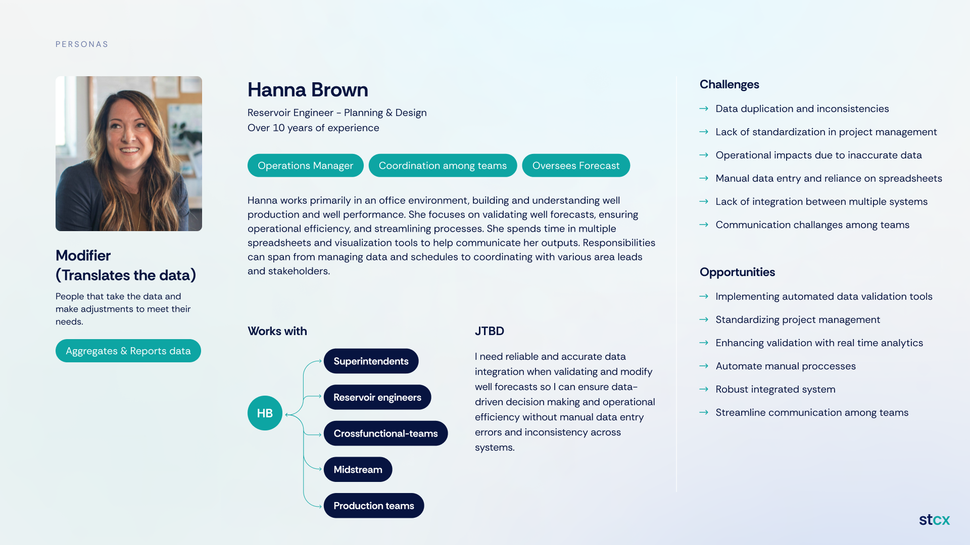
We ran a 4-week discovery phase with cross-functional stakeholders — not just to gather requirements, but to understand the behavioral patterns behind how forecasts were actually created, reviewed and approved.
Four insights shaped everything that followed: Excel was being used as database, tracker and communication tool all at once; lack of version control created constant misalignment; analysts needed a safe space for scenario testing; and leaders needed quick access to risk signals without digging for them.
Mapping the system before redesigning it.
I mapped the entire MBR and QLA forecasting cycles to visualize how data, decisions and responsibilities flowed across teams. The blueprint revealed redundant steps, information silos, manual handoffs and high cognitive load during critical decision moments — and became our north star for redesigning the workflow, not just digitizing the old one.
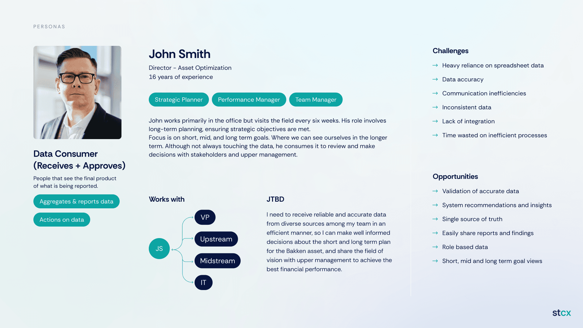
Designing for behaviors, not departments.
Analysts needed deep control, scenario simulation and traceability. Decision-makers needed fast insights, comparisons and risk visibility. These behavioral differences — not org charts — informed the navigation structure, information hierarchy and level of interface complexity for each role.
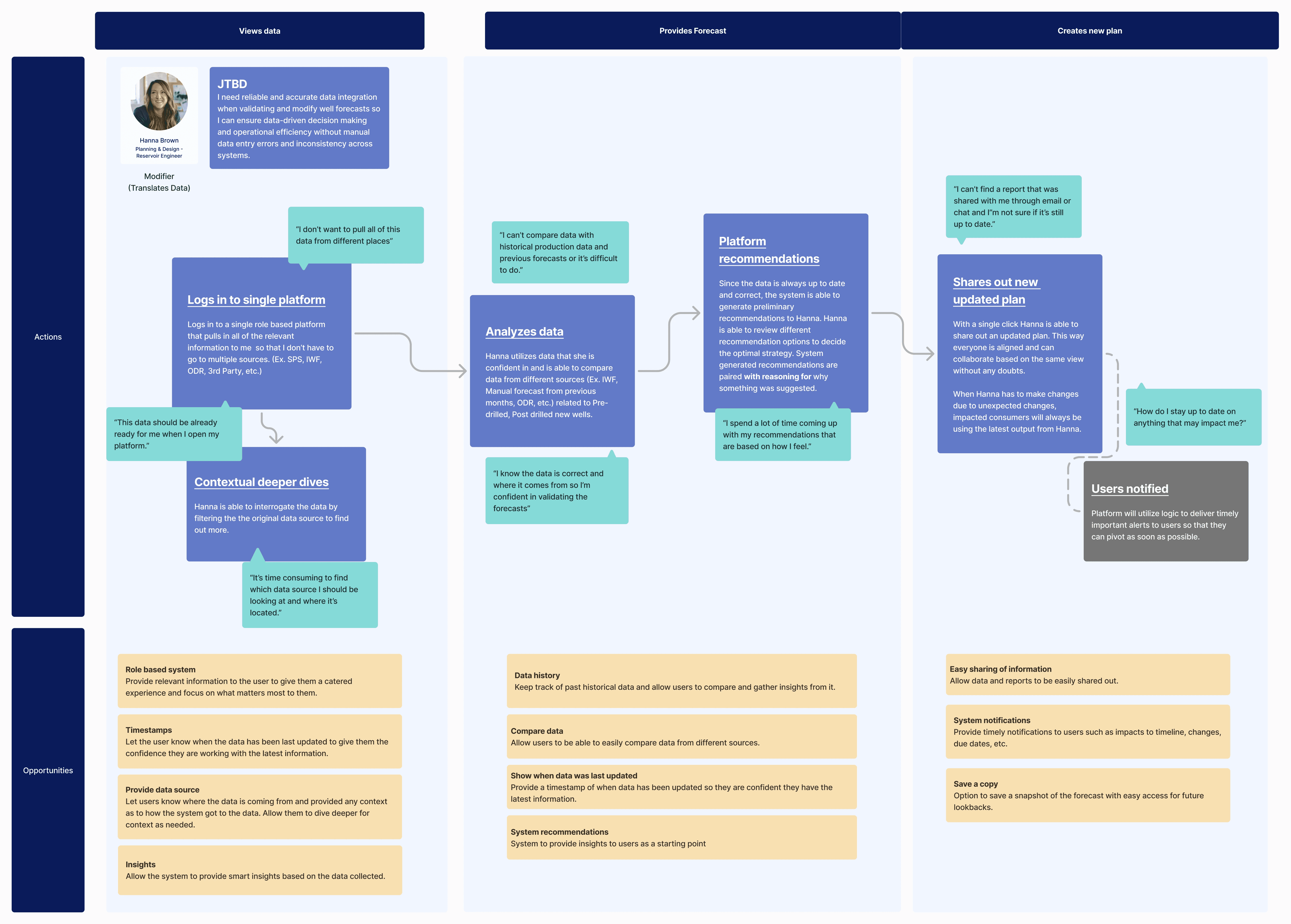
Following the forecast from data to decision.
I mapped the key journeys and turned them into user flows — reviewing a new forecast, simulating alternative scenarios, aligning teams before decision deadlines — to identify friction points like manual handoffs, unclear ownership and missing validation steps. Those flows directly informed feature prioritization and became the base for the wireframes.
One dashboard per person, then one shared structure.
We started by wireframing a separate view for every stakeholder we interviewed, module by module: KPI tracking, visuals, database, SAP, 30-60-90 plans and reporting. Putting them side by side showed that most of what each person needed overlapped. So we dropped the per-person dashboards and converged on two shared layouts, then tested them against all four personas.
A dashboard per stakeholder
Each role got its own view. It mirrored the org chart, duplicated most of the content and kept the "which version is right?" problem alive.
Two shared layouts
A KPI overview everyone sees, and a workstream view with one main visual plus supporting data. Roles change the depth, not the structure.
Tested on all personas
The same layouts were filled with each persona's real tasks to check that nobody lost something they needed.
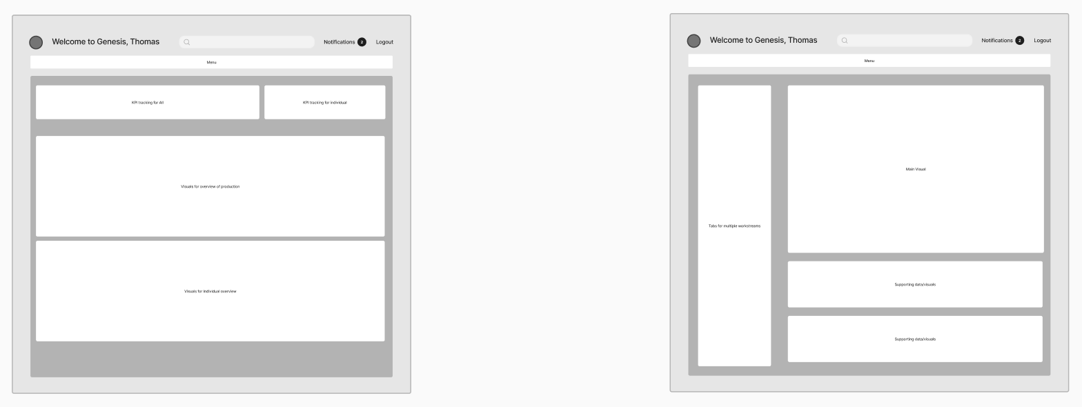
Converge step: the two shared layouts that replaced the per-person dashboards.
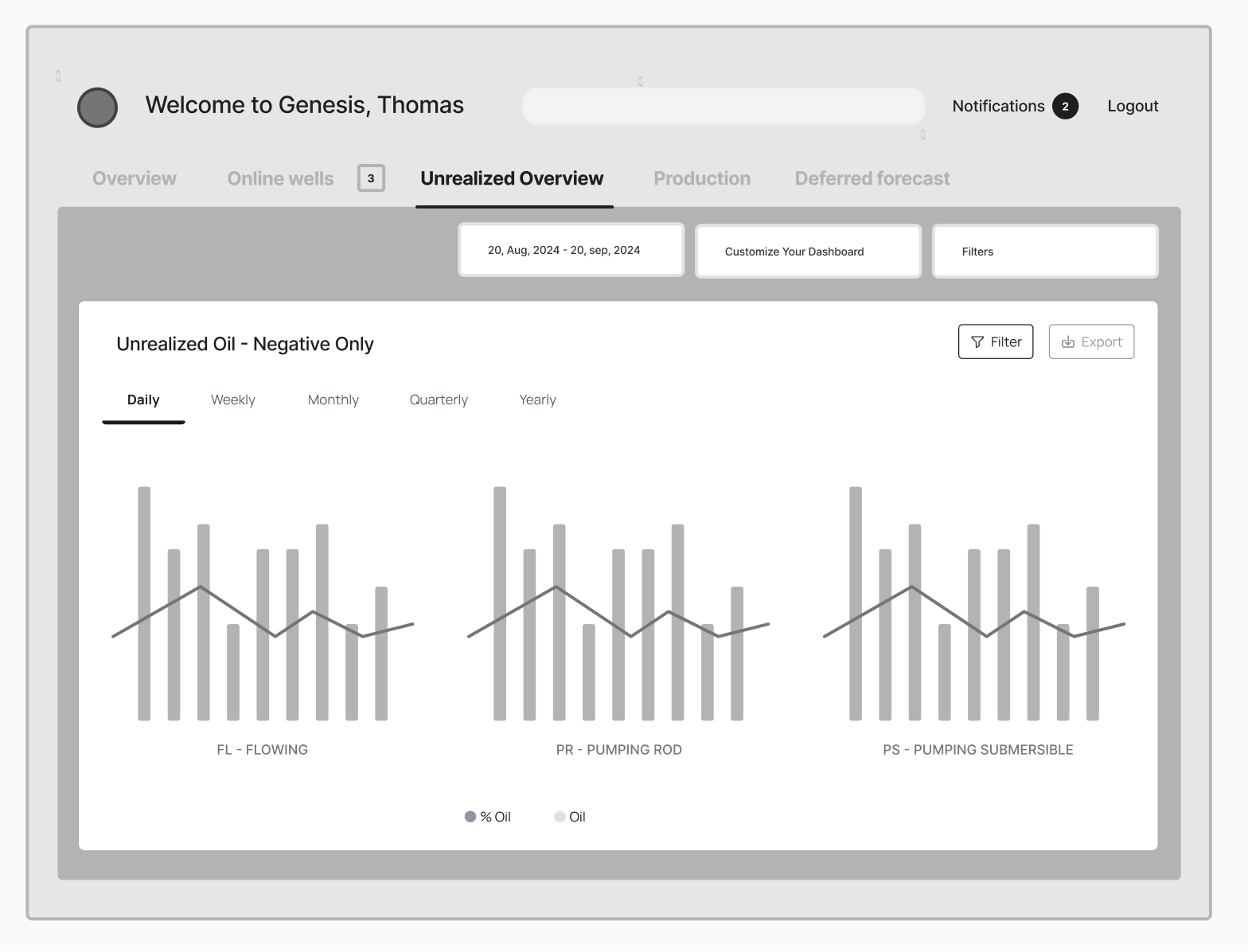
Low-fidelity wireframe of the Unrealized Overview, before visual design.
Four principles guided every decision.
Clarity over visual complexity. Comparison as a primary action. Traceability of assumptions. Progressive disclosure for advanced analysis. Every interface and interaction decision that followed was measured against these four principles.
One platform, shaped differently per role.
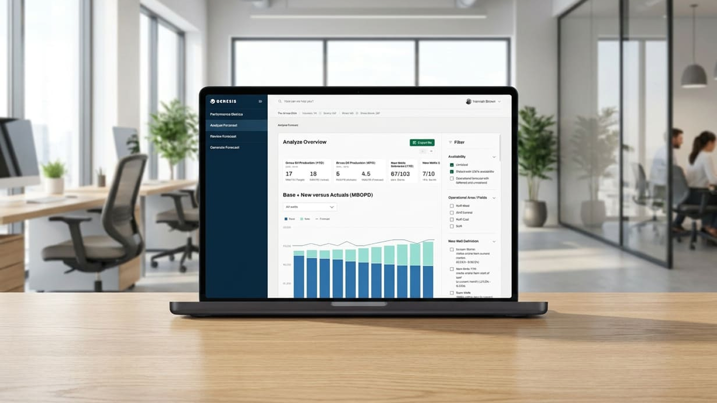
The platform adapts to different user roles, surfacing forecast creation tools, status indicators, performance dashboards and version comparison views depending on who's logged in.
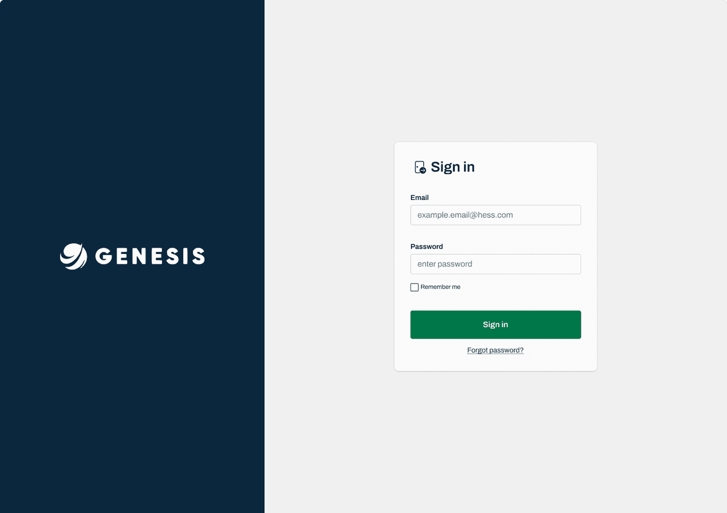
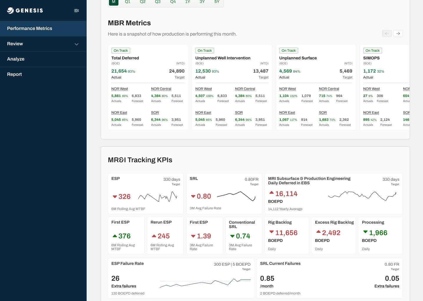
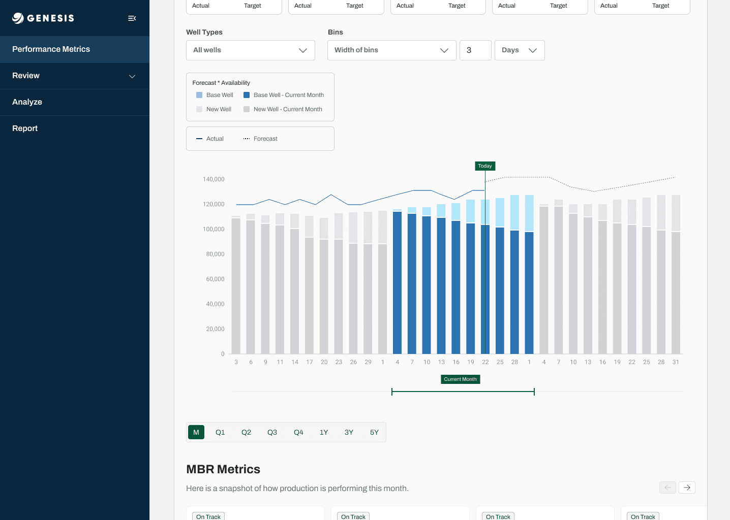
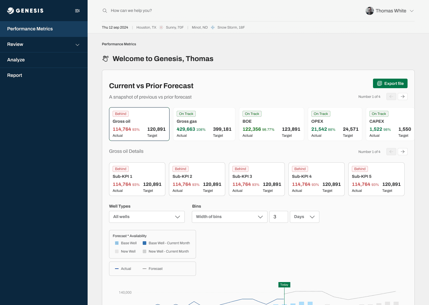
The home dashboard: current vs. prior forecast, at a glance, the moment you log in.
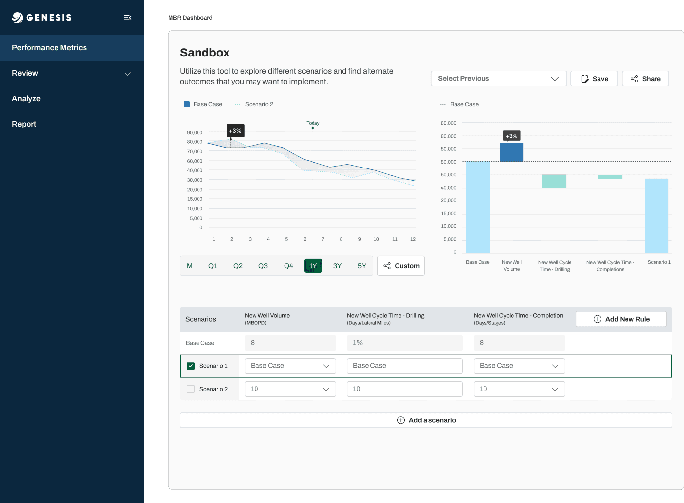
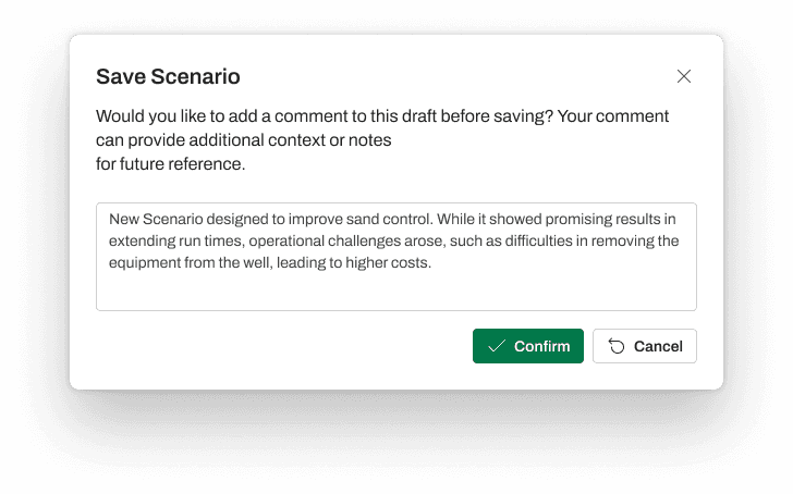
The Sandbox — the feature at the center of this project. Users simulate production scenarios by adjusting variables like cycle time, output volume and failure rate, with real-time updates. It replaced offline Excel simulations and became the tool analysts trust most for testing "what if" before committing to a plan.
Making dense data scannable.
Special attention went into data visualization — letting users compare forecast versions, identify anomalies, filter time-series data and export annotated insights without leaving the flow they were already in.
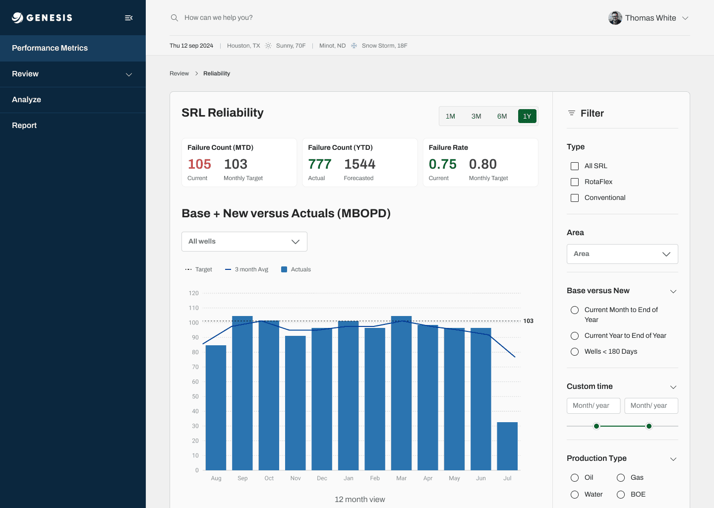
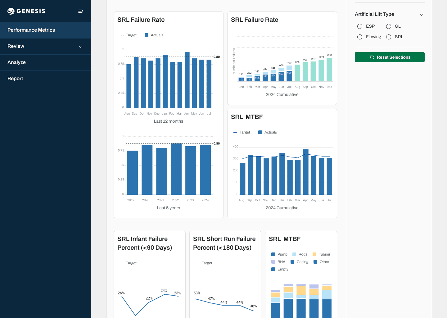
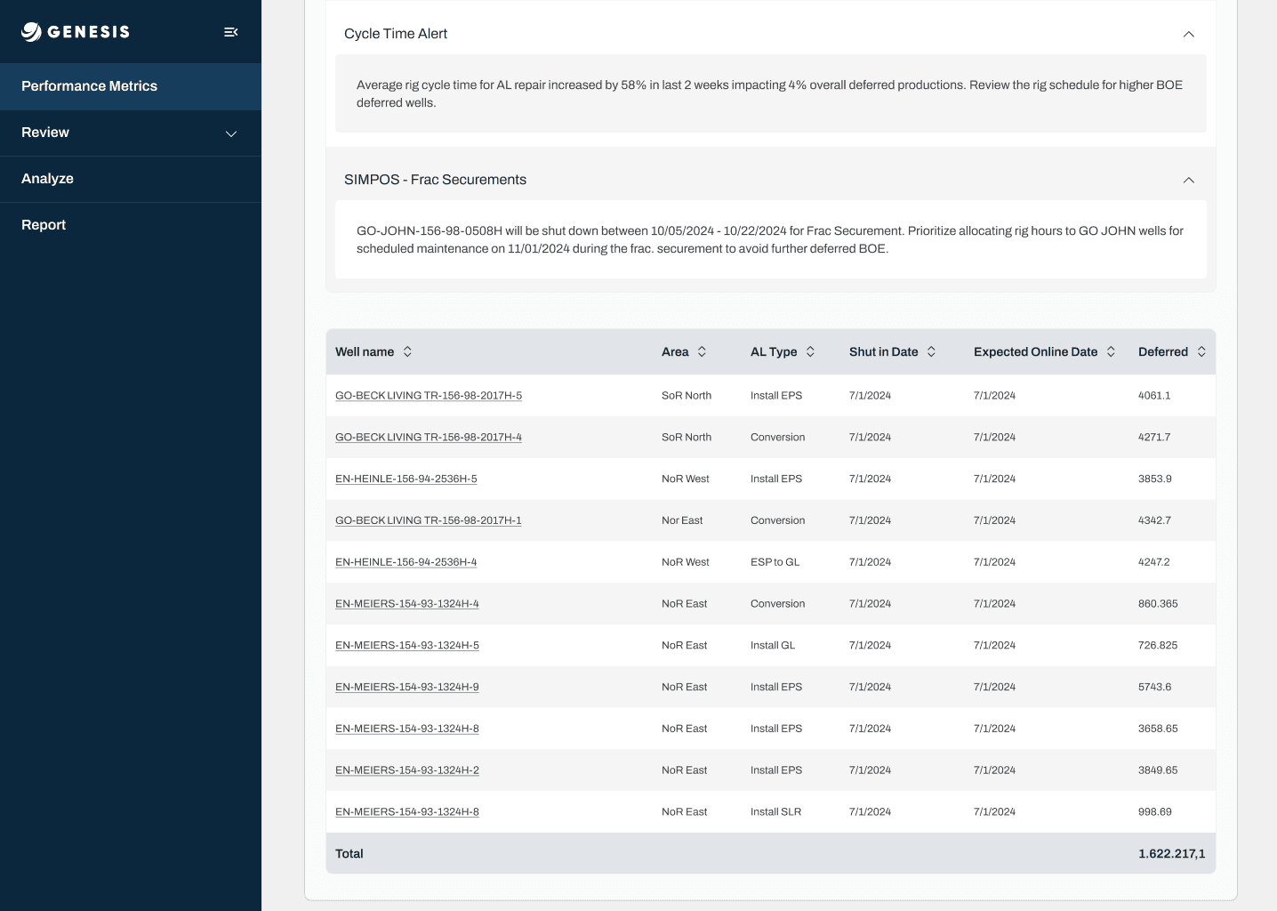
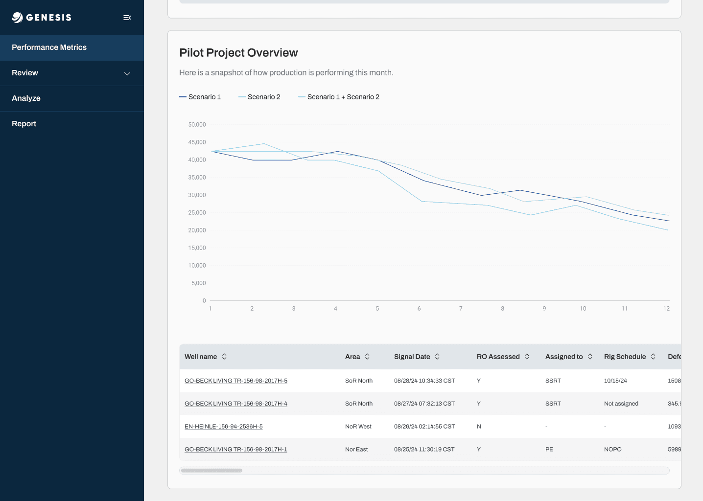
Pilot Project Overview — comparing scenarios against actuals, with the underlying well data one click away.
From spreadsheets to one source of truth.
The teams who fed the forecast tables reported spending about 30% less time gathering data by hand. Forecasts now live in one platform instead of scattered files, and user feedback pointed to more confidence in the numbers behind each decision.
More precise forecasts
Automated data entry replaced manual typing, reducing errors that led to losses in product availability and value.
~30% less manual work
Self-reported by the people who maintained the forecast tables before and after the platform.
One shared version
Analysts and leaders compare and approve from the same data, with version history instead of file copies.
Impactful UX in complex systems is less about visual polish and more about reducing cognitive load, supporting decision-making, and designing for long-term product evolution.